Travel Guidebook
My objective of this travel guide is to create an engaging travel guidebook for short-term visitors to Tokyo, offering detailed itineraries, cultural insights, and practical tips to experience the city’s unique blend of tradition and modernity.
Nov 5, 2024
Role
Designer
Role
Designer
Role
Designer
Service
Graphic Design
Service
Graphic Design
Service
Graphic Design

Design Execution
Design Execution
Design Execution
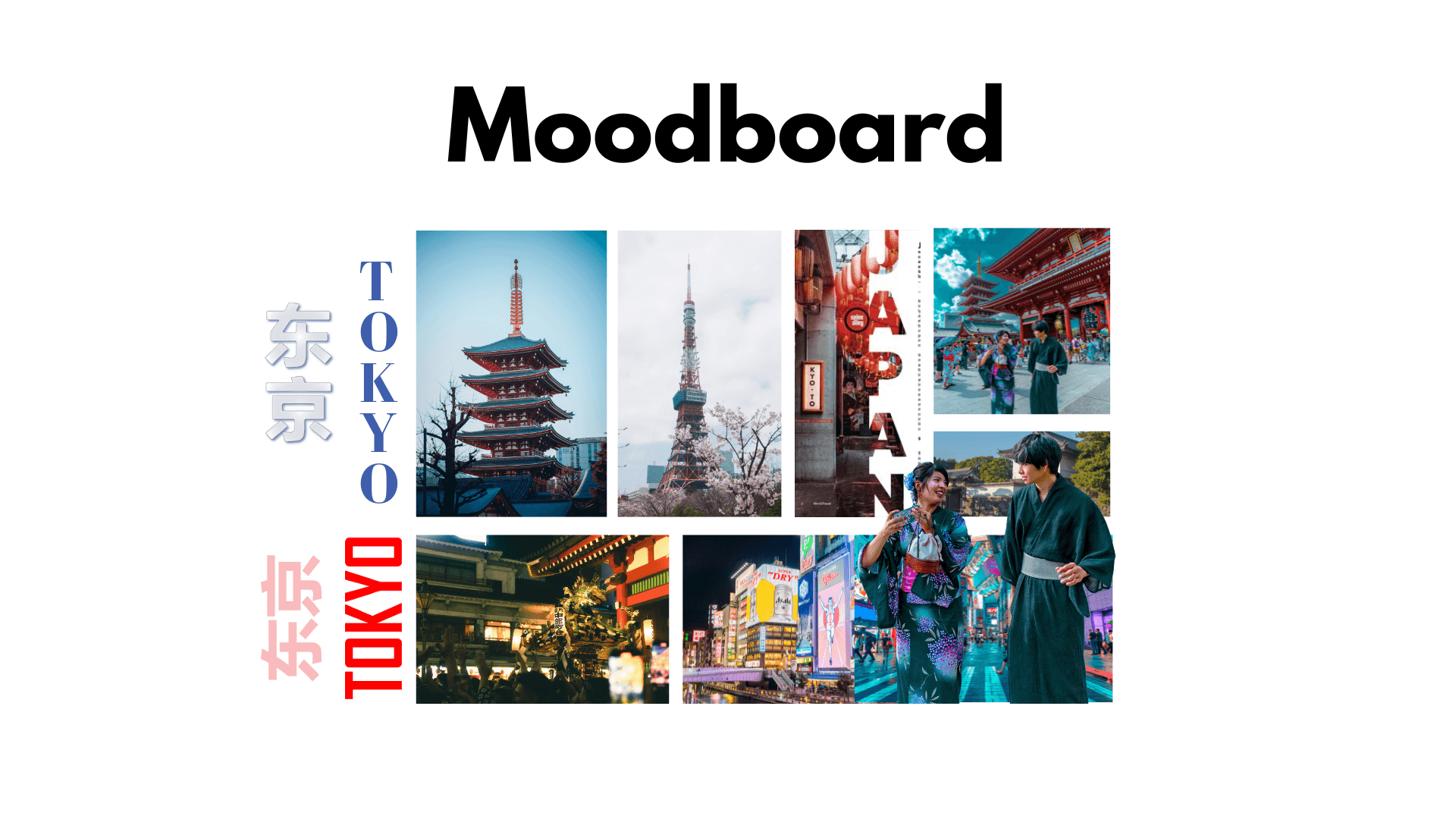
For this travel guidebook, I implemented a two-column grid layout to enhance readability and allow readers to absorb information quickly without straining across wide text blocks. The color concept centers on red, symbolising Japan’s temples, lanterns, and rich culture, blended with a modern aesthetic to reflect Tokyo’s unique character.
I used sans serif fonts (Agency FB for titles, Candara Bold for subheadings, and Candara Regular for body text) to maintain a clean and organised look while ensuring legibility alongside detailed visuals. The title “TOKYO” stands out boldly to capture attention, while subheadings and body text remain clear and accessible.
Overall, this design execution focuses on clarity, cultural representation, and visual balance, presenting information in an engaging and easy-to-navigate layout for readers planning their Tokyo trip.
Final Outcome
Final Outcome
Final Outcome
The final guidebook effectively presents Tokyo’s highlights in a concise, visually appealing format, helping visitors plan their trip with ease. It delivers clear information, cultural insights, and practical tips, creating an engaging and user-friendly travel resource.
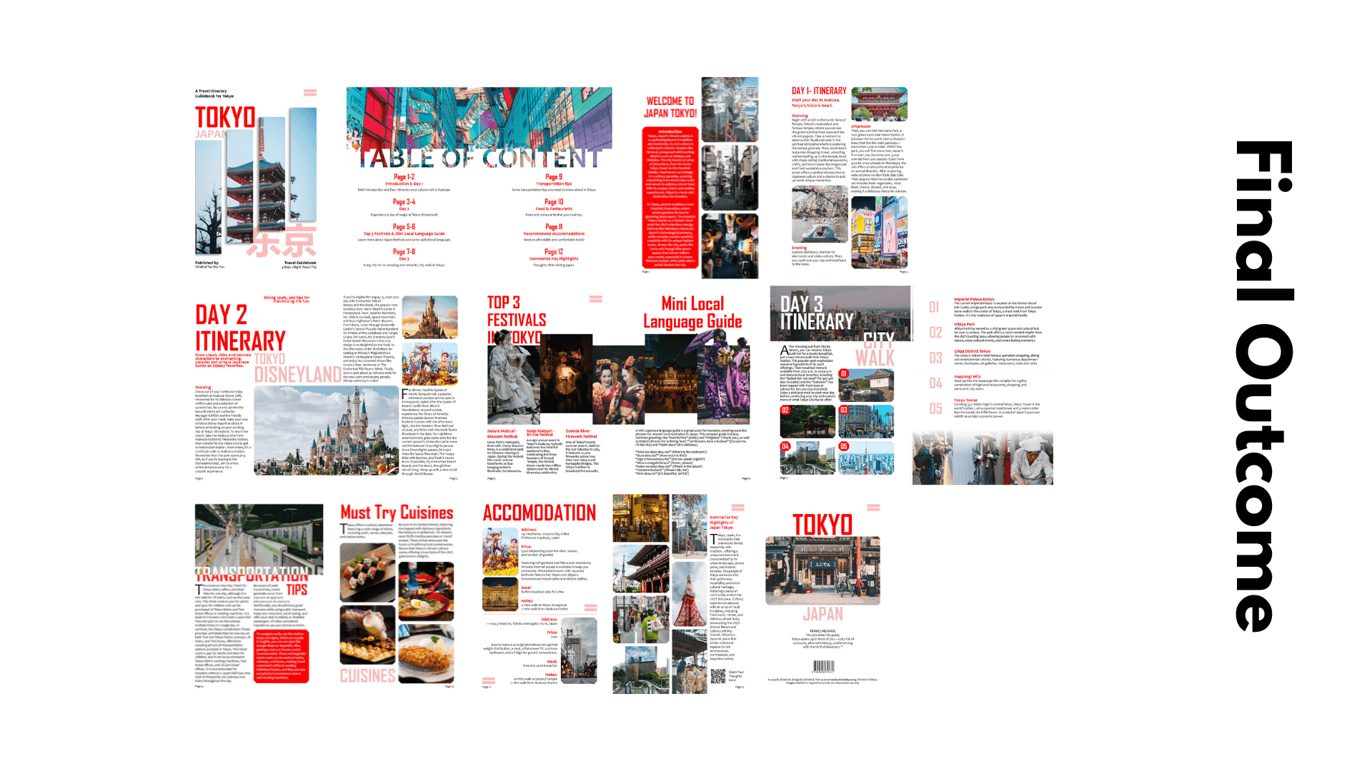
The final guidebook effectively presents Tokyo’s highlights in a concise, visually appealing format, helping visitors plan their trip with ease. It delivers clear information, cultural insights, and practical tips, creating an engaging and user-friendly travel resource.
The final guidebook effectively presents Tokyo’s highlights in a concise, visually appealing format, helping visitors plan their trip with ease. It delivers clear information, cultural insights, and practical tips, creating an engaging and user-friendly travel resource.
