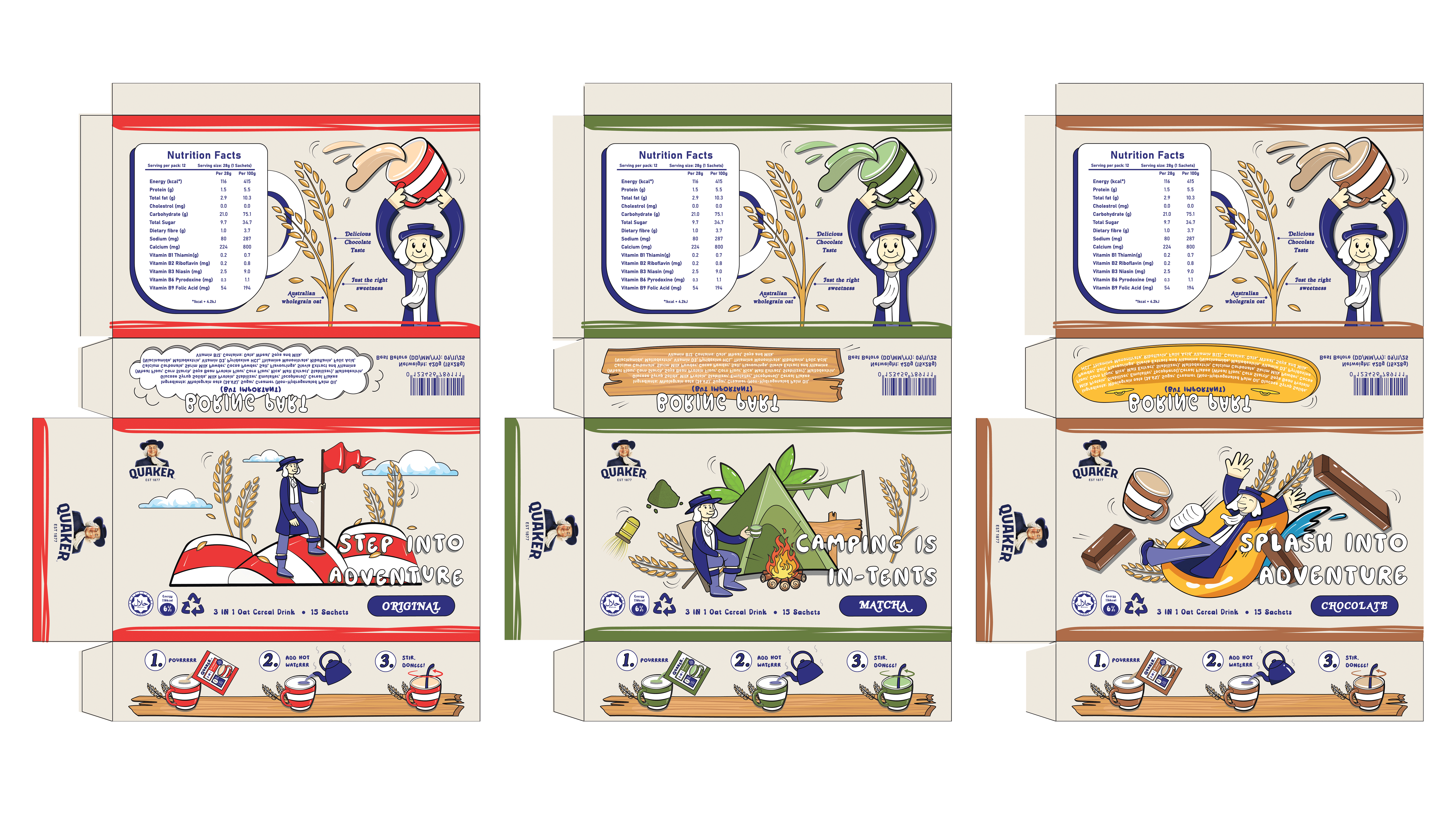
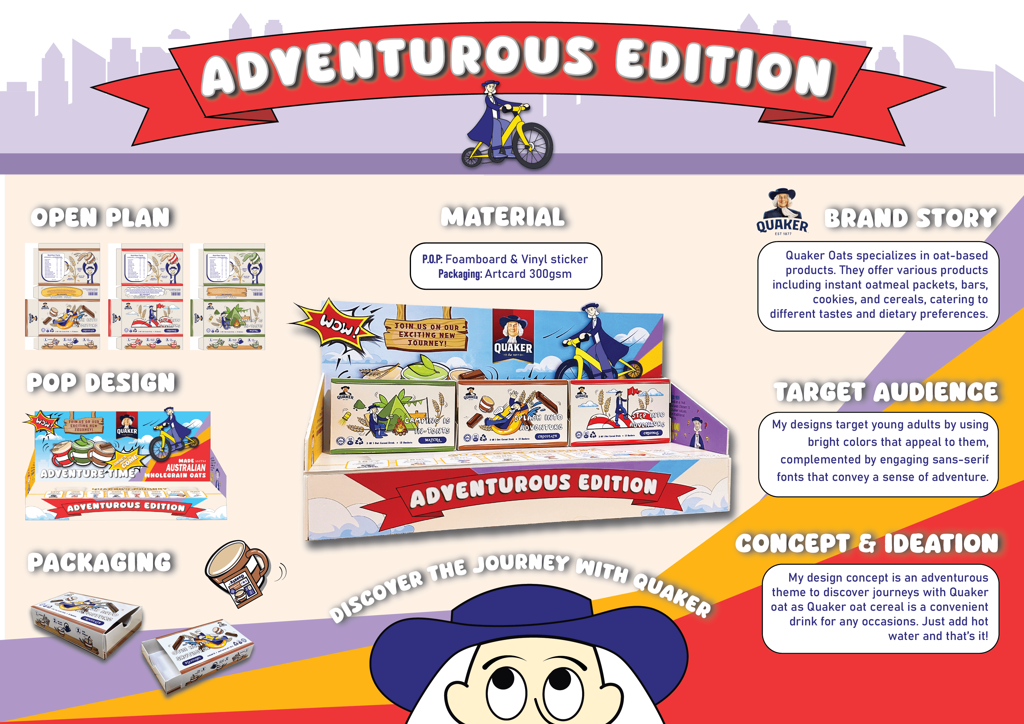
Packaging Design

For this project, I redesigned the packaging of Quaker Oat with a focus on sustainability. The outcome includes a series of cohesive packaging designs that align with the brand identity while minimising environmental impact. Additionally, I created a point-of-purchase (POP) display design to enhance product visibility and attract customers in retail settings.

Jul 5, 2024

CLIENT

Quaker Oat

CLIENT

Quaker Oat

CLIENT

Quaker Oat

Role

Designer

Role

Designer

Role

Designer

Service

Packaging Design

Service

Packaging Design

Service

Packaging Design

Quaker Oat
Quaker Oat
Quaker Oat

Part 1: Packaging Design

Part 1: Packaging Design

Part 1: Packaging Design

My design concept a slide-out box with 3 different flavours (Original, Matcha, Chocolate) which can be stacked together as an organizer. My idea is to create an adventurous theme which consist playful activities like hiking, camping and waterpark. Embracing a playful aesthetic with a sans-serif font and utilizing messages that resonates for young adults. The color palette remains anchored in blue, beige tones and the corresponding colour to a particular flavour. The unique selling point in my design is that I also highlight its quality, healthiness, sustainability in the packaging in a playful and fun way.


My design concept a slide-out box with 3 different flavours (Original, Matcha, Chocolate) which can be stacked together as an organizer. My idea is to create an adventurous theme which consist playful activities like hiking, camping and waterpark. Embracing a playful aesthetic with a sans-serif font and utilizing messages that resonates for young adults. The color palette remains anchored in blue, beige tones and the corresponding colour to a particular flavour. The unique selling point in my design is that I also highlight its quality, healthiness, sustainability in the packaging in a playful and fun way.


My design concept a slide-out box with 3 different flavours (Original, Matcha, Chocolate) which can be stacked together as an organizer. My idea is to create an adventurous theme which consist playful activities like hiking, camping and waterpark. Embracing a playful aesthetic with a sans-serif font and utilizing messages that resonates for young adults. The color palette remains anchored in blue, beige tones and the corresponding colour to a particular flavour. The unique selling point in my design is that I also highlight its quality, healthiness, sustainability in the packaging in a playful and fun way.


Part 2: Point of Purchase

Part 2: Point of Purchase

Part 2: Point of Purchase

In this stage, we focused on designing a Point of Purchase (POP) display that complements and enhances our product packaging. The goal was to create an engaging retail setup that not only showcases the product attractively but also captures the essence of our brand identity.

Material: A0 Sticker on Foamboard

Create a free website with Framer, the website builder loved by startups, designers and agencies.